Cleavage Clinic
BRANDING GUIDELINES
cleave clinic is a modern aesthetic clinic offering a non-surgical, natural approach to breast enhancement. the brand focuses on expert-led treatments, minimal downtime, and personalized care — all delivered through a clean, elevated, and intentional experience. our work centered on refining their visual identity to better reflect that philosophy.
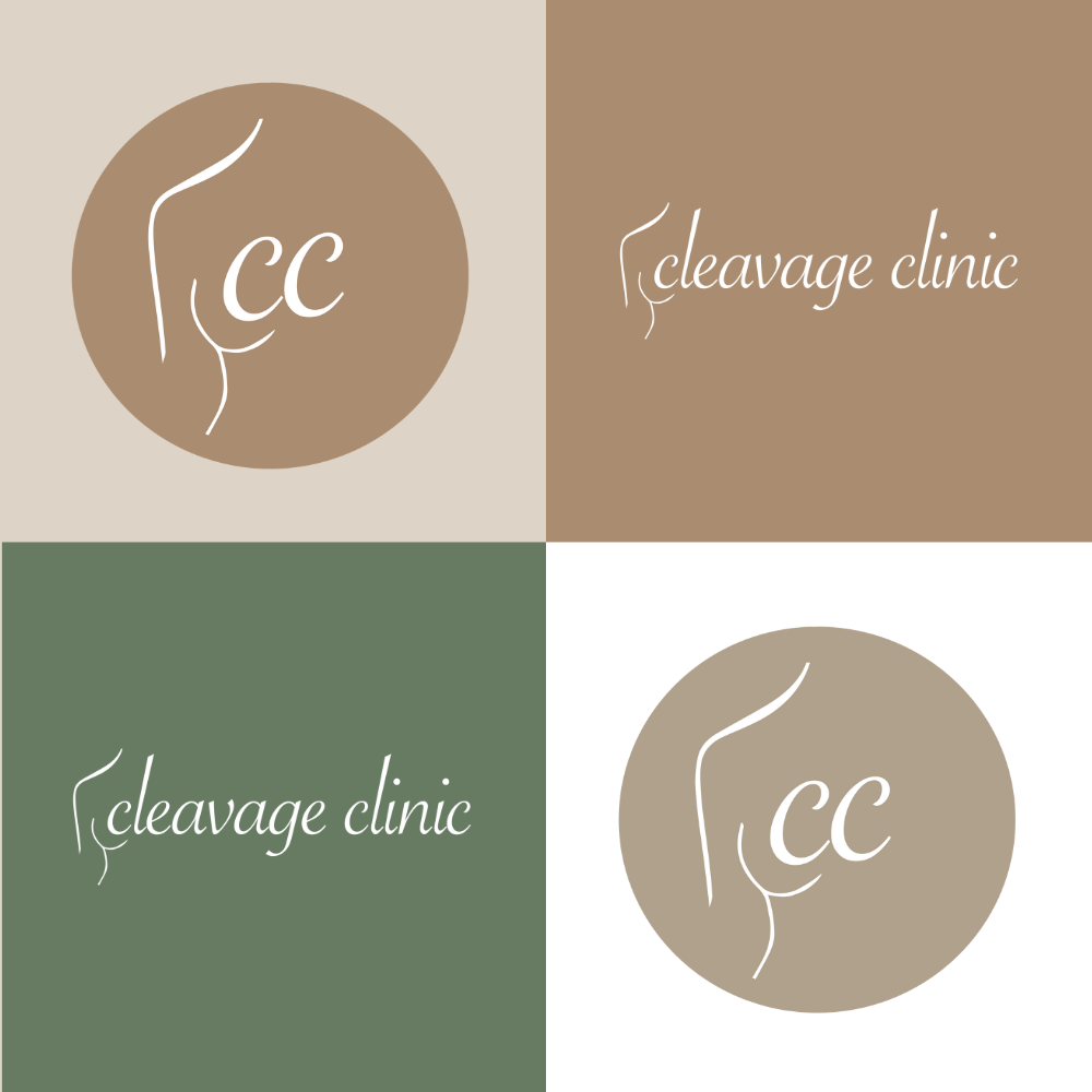
LOGO & WATERMARK
we rebuilt cleave clinic’s logo system with a focus on clarity, balance, and versatility. the guidelines define the use of primary and secondary logos, along with watermarks and icons designed for subtle brand reinforcement across digital and printed materials. every mark was created to feel refined, minimal, and consistent across all applications.
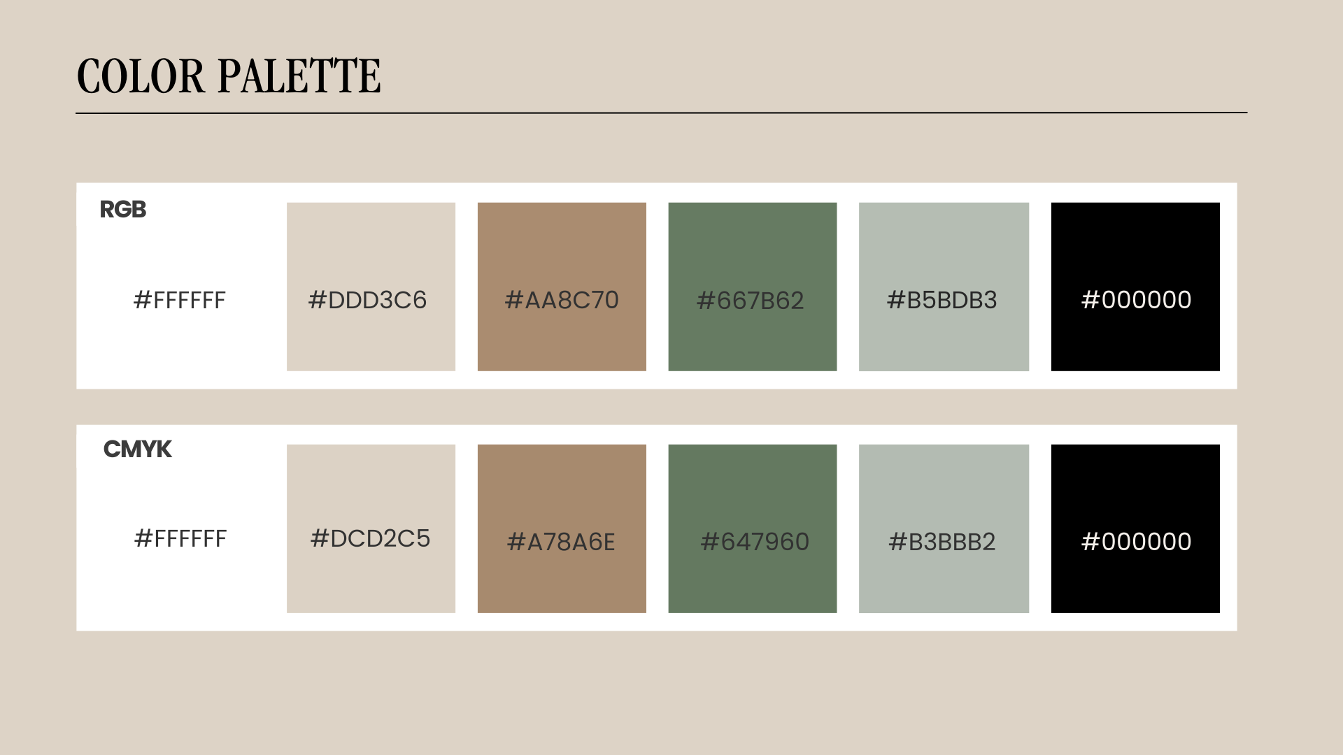
COLOR PALETTE & TYPOGRAPHY
the color palette blends soft neutrals with deeper, grounded tones — creating a calm, modern, and slightly luxurious feel. all color combinations were tested for accessibility and contrast to ensure clarity and compliance across platforms.
typography pairs a classic serif with a clean sans-serif, balancing elegance with readability. together, these elements support a brand voice that feels professional, aesthetic, and approachable.
GUIDELINES OVERVIEW
for cleave clinic, we developed a concise brand guideline system focused on the core visual elements of the brand: logos, color palette, and typography. the goal was to refine the existing identity and align it more closely with the clinic’s values of natural results, expertise, and personalization.
the guidelines establish clear rules for logo usage, color combinations, and typographic hierarchy, ensuring consistency across all touchpoints. the final system feels modern, minimalist, and elevated — supporting cleave clinic’s positioning as a premium, non-surgical aesthetic provider.