Hola Self
BRANDING GUIDELINES
hola self is a self-care brand created as a gentle, intentional space for latin women to reconnect with their inner world. originally conceived as hello self, the brand evolved into hola self to reflect a spanglish identity that feels culturally rooted, warm, and authentic. our work focused on building a brand system that feels emotionally grounded, refined, and deeply personal.
LOGO & WATERMARK
the logo system was designed to feel soft, intentional, and timeless. it includes a primary logo, secondary variation, and a simplified watermark for subtle brand presence across digital and printed applications. the forms and spacing were carefully crafted to support clarity, calmness, and emotional connection, while maintaining consistency across both language versions of the brand.
COLOR PALETTE
the color palette was developed to support feelings of calm, grounding, and gentle self-connection. it combines soft neutrals, warm earth tones, and muted natural hues to create a visual language that feels nurturing and balanced. all color combinations were tested for accessibility and contrast, ensuring consistency and usability across platforms.

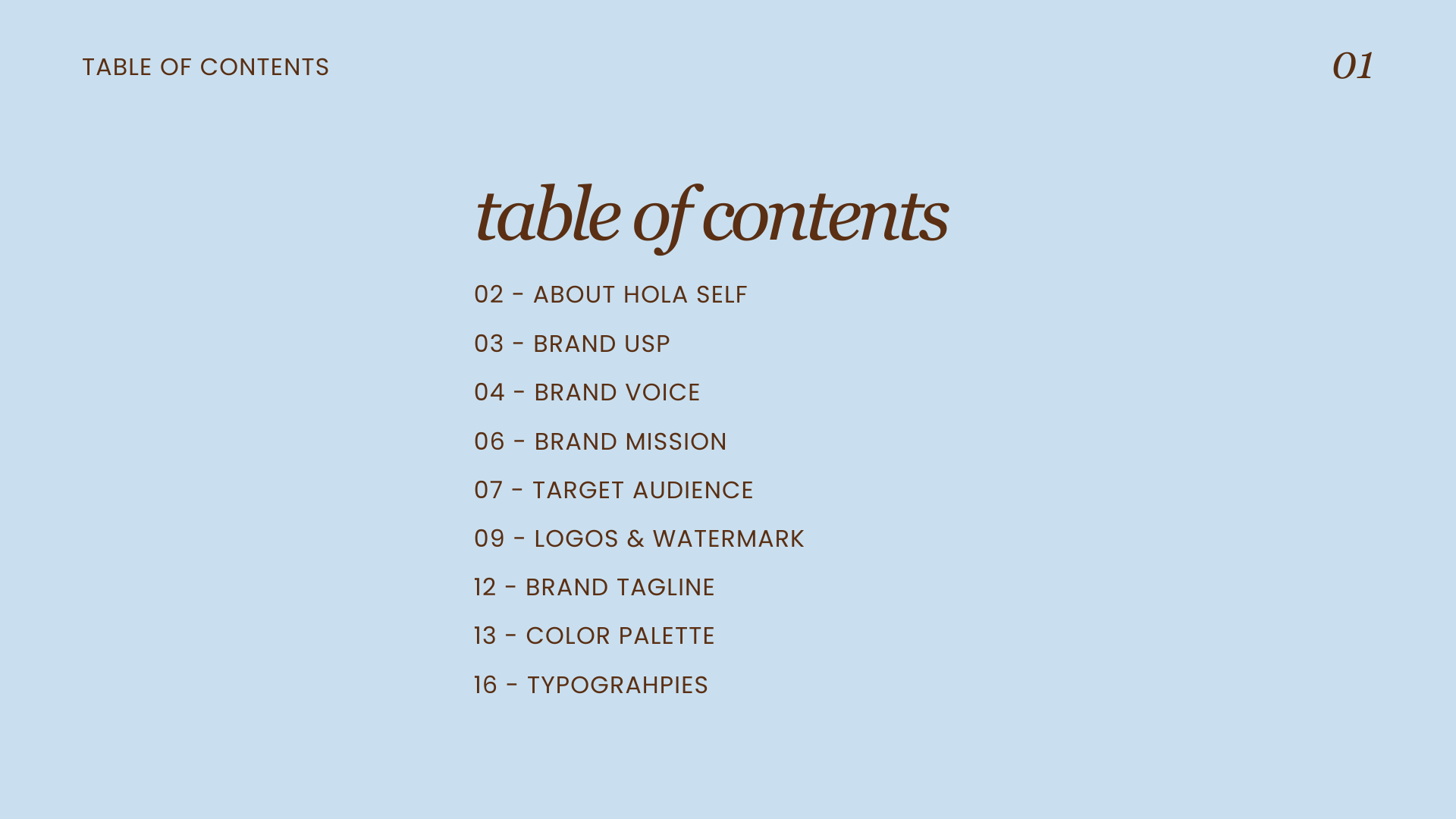
GUIDELINES OVERVIEW
for hola self, we created a complete brand guideline system covering visual identity, brand voice, mission, usp, target audience, logo usage, color palette, and typography. a key component of this project was delivering the guidelines in both english and spanish, ensuring the brand could communicate clearly and authentically with its community.
the final identity reflects hola self’s purpose: to create a safe, intentional space for reflection, growth, and emotional awareness. every element of the system was designed to feel warm, empowering, and thoughtfully aligned with the brand’s mission — supporting consistency while honoring cultural nuance and personal connection.