The Balanced Flow
BRANDING GUIDELINES
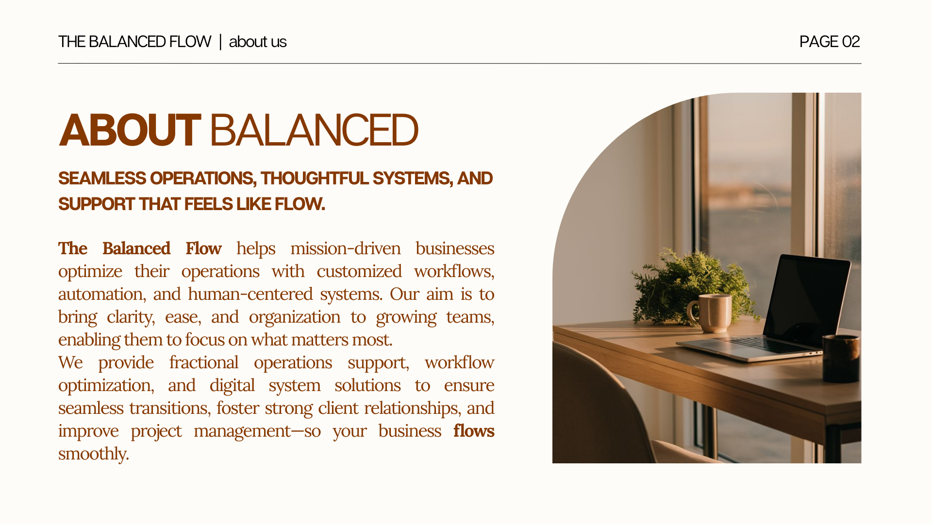
the balanced flow is an operations support brand built for mission-driven businesses looking to simplify, scale, and work with more clarity. their approach blends thoughtful systems, human-centered workflows, and strategic structure — all designed to bring ease and flow into day-to-day operations. our work focused on creating a brand identity that visually reflects that balance.
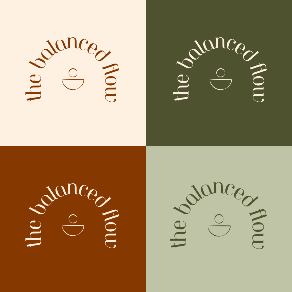
LOGOS & BRAND MARKS
the logo system was designed to feel clean, intentional, and adaptable. it includes a primary logo, secondary variations, a watermark, and an icon — allowing flexibility across digital platforms, internal documents, and branded assets. the structure of each mark reinforces clarity and balance, while maintaining a warm, professional presence.
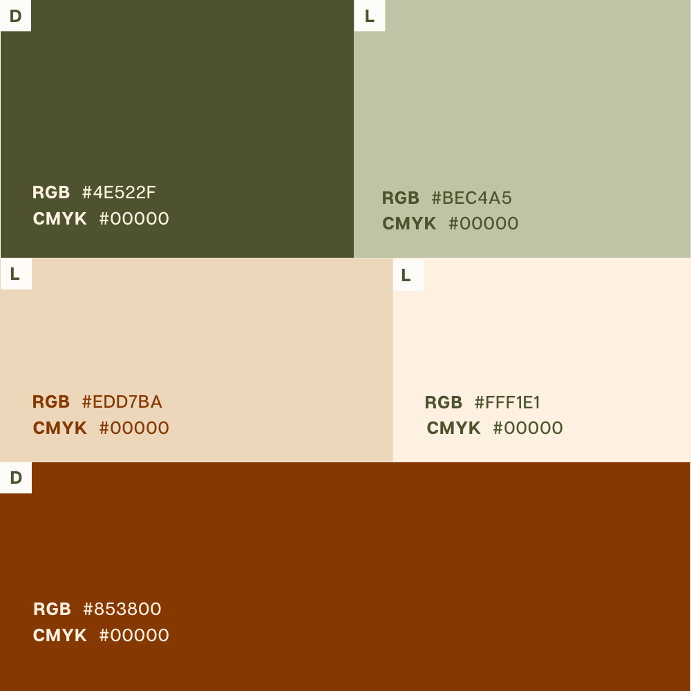
COLOR PALETTE
the color palette combines warm neutrals, soft beiges, terracotta tones, and grounded greens. this mix was chosen to reflect balance, calm, and approachability, while still feeling professional and modern. the palette also includes clear usage rules and accessible color combinations to ensure consistency across all applications.
GUIDELINES OVERVIEW
for the balanced flow, we developed a comprehensive brand guideline system that defines the foundation of the brand. the guidelines outline brand values, voice and messaging, target audience, logo usage, color palette, and typography — creating a clear framework for consistent communication.
the identity was designed to mirror the experience the brand provides: organized, thoughtful, and human-centered. every element works together to support a cohesive visual language that feels calming, structured, and flexible, giving the balanced flow a strong and reliable presence as they grow.